I don’t know about you, but
I dread the thought of falling into a rut and losing my creative spark. Traveling
is one surefire way I keep adding fuel to my creative fire. While every
destination on the globe doesn’t have a distinct “style”, I enjoy noticing the subtle
type and image elements that continually reappear when looking at the breadth
of the work from each locale. These reoccurring themes help me connect the visual dots and offer
a sense of each culture’s visual voice.
How often have you heard me
say this: We are social commentators of our time and we design in response to
what is happening around us. Thanks to technology design actively participates
in a global dialogue and we can reference a bounty of vernacular design for
inspiration. I ask you to expand your creative horizons and explore cultural design
not only by viewing examples on screen but with a more hands on, fully engulfed
in the cultural experience approach that only traveling and witnessing visual
communication first hand offers. I’m certain your journey will lead you down
unexplored pathways and maybe to your next brilliant visual communication
design solution.
Recently I traveled to the
exotic jungle and beaches of Costa Rica. Camera in hand, I documented examples
of Costa Rican design that caught my eye. Costa Rica is a country in Central
America, bordered by Nicaragua to the north, Panama to the southeast, the
Pacific Ocean to the west and the Caribbean Sea to the east. (1) Its area
slightly exceeds that of Vermont and New Hampshire combined. OK, not too large
but certainly jam packed with wonderful examples of visual communication! Enjoy and get inspired! ;)
 |
| Hand lettering and imagery painted on tile. Hand written type is a common thread found in Costa Rica's signage. This organic line quality connects nicely to Costa Rica's view to life. Pura vida means "pure life," but more than anything, it's a way of life. This phrase symbolizes the Costa Rican idea of letting things go, and simply enjoying life. Use it as an answer to "como estás?" ("how are you?"), or to say "thank you" or "you're welcome." |
 |
| Detail of hand lettering. |
 |
| Outdoor store signage. The naturally weathered texture reminds me of vintage French packaging. |
 |
| Outdoor store signage created from laser cut metal mounted onto a background of textured slate. |
 |
| Another example of outdoor store signage. Hand painted and weathered creating a beautiful texture. |
 |
| A house sign (many of the houses are named) comprised of hand letters carved out of wood. |
 |
| Detail of house sign. |
 |
| I have never seen so many designs using dreaded "Papyrus" in my life. It was everywhere and I mean EVERYWHERE! This is the most tastefully done version utilizing laser cut metal and natural stone that is backlit at night. |
 |
| Black mosaic tile spelling out "the black cat." |
 |
| Detail of the black cat mosaic tile. |
 |
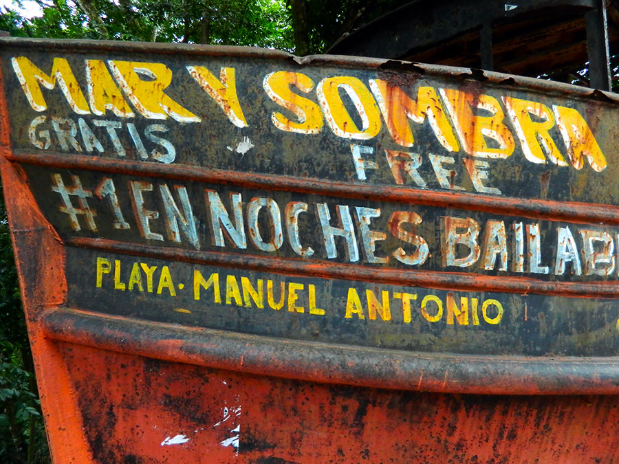
| Weathered type on the side of an abandoned boat. Gritty, grainy, rusted, pealing cracking letterforms... just beautiful! |
 |
| Outdoor store signage for a restaurant. |
 |
| I found the previous restaurant's packaging in the local market. |
 |
| Outdoor store signage. |
 |
| Outdoor store signage. |
 |
| A portion of outdoor signage. The letterforms are created from an airbrushed stencil technique. |
 |
| Outdoor store signage consisting of hand lettered and painted type. |
 |
| Beautiful packaging in a local market. |
 |
| Vintage outdoor advertising! |
 |
| I even found hand lettered type on the puddle jumper en route to the airport. The view is of San Jose. |
In conclusion
I so want you to delve into the vernacular and explore other cultures. I know it will inspire you and feed your design! Do not follow where the path may lead. Go, instead, where there is no path and leave a trail. Ralph Waldo Emerson
(1) http://en.wikipedia.org/wiki/Costa_Rica