We each have an individual way of creating: bringing distinctive experiences, diverse talents and a unique voice to the creative table. If we learn others’ processes, we can enhance our own, in a sense build better creative tools to use when designing. Learning the processes of those we respect and admire is a tool that furthers our knowledge of graphic design and serves to present endless inspiration and countless methods of creation.
The intent of the “shout out” series is to feature design innovators, gain insight into their creative process, discover how their philosophies influence my own idea generating/design process and offer you a chance for creative inspiration and growth. From a personal standpoint, I want to determine if this hybrid of creativity leads my designs down surprising, unexplored pathways ultimately expanding my own creative toolbox.
Jeremy Gilberto
Jeremy Gilberto started attending Kutztown University of Pennsylvania as an art education major. Discovering his true passion for graphic design, he transferred into the Communication Design program concentrating mostly on advertising. Jeremy earned his BFA and began his professional career working as a junior art director at Arc Worldwide/Leo Burnett in Chicago, Illinois. “I was hired to be on the tobacco team, which has its ups and downs, one of those downs is the fact I can’t share a majority of my current work and also that twenty percent of my design is covered with a warning label.” Fortunately, Jeremy creates a variety of work for clients beyond tobacco such as “Beef. It’s what’s for dinner” and Samsung.
Favorite visual communication design quote Jeremy lives by
Jeremy initially answers with a quote by Leo Burnett, “Curiosity about life in all of its aspects, I think, is still the secret of great creative people.” “Always view the world through the eyes of a child and see things in a new light. Living life through this lens makes you a better creative and probably an all around better person.”
Three self identified, descriptive words best describing “Jeremy Gilberto”
• Risk-taker. “Or at least I aspire to be more of one. Never be afraid of surprising people or even making them feel uneasy. I’m reminded of a challenge from one of my slightly inebriated superiors, ‘I want you to present me things that make me want to fire you.’ A strange, scary and yet awesome thing to be asked because it’s in taking risk that great work is born.”
• Versatile. “Resource managers love working with me because they can put me on any project and know that I’ll be able to do it. This is why I’ve had the privilege of working on everything from print to web. I don’t limit my skill set. I never want to just be the web guy or the print guy. I try to do it all. Never stop learning, if there’s something you don’t know how to do, take that as a challenge and do it. Just don’t let too many people know you’re multifaceted because then you’ll be asked to help with everything.”
• Reasonable. “This word seems to contradict me as a risk-taker, but when I say risk-taker I mean a calculated risk-taker. At the end of the day your ideas and your designs have to work for the client. While your creativity should never be stifled, you still have to create work that does what it needs to do.”
The Gilberto design philosophy
“Go with your gut. If it feels right to me it usually feels right to others. Most of us know when something doesn’t feel right. That’s why graphic design requires late hours. We tweak things or start over and continually work at it until we know it’s right.” Placing emphasis on intuition (otherwise known as following your gut instinct) helps you find your own visual voice. We’re creative thinkers and interjecting our own point of view into designs is what helps bring unique solutions to the table. The goal is to develop a stand out message, right? Since you have your own perspective, your own point of view, you can offer what no one else can.
“Much like art, design is subjective, what’s beautiful to one person may not be to another, but going with your gut gives you a certain amount of confidence. Standing by your creation carries a lot of weight. Everyone has an opinion but if you trust yourself you’ll go far.” Jeremy’s comment encourages me to mention the importance of finding a balance between the objective and subjective in your work. Every communication solution you develop must be a hybrid of your own perspective/gut instinct (subjective) and well-researched facts (objective). For an in depth discussion on this subject, please read my blog post “
Objective and Subjective."
Awards or publications featuring the design stylings of “Jeremy Gilberto”
“Student transit ads I designed for Diesel Jeans were featured in CMYK magazine volume number 47 and I was featured in issue 4 of Untitled32.com; a design based publication for graphic designers providing inspirational articles, exceptional design work and current events.”
A standout, defining moment in Jeremy's career thus far
“Getting hired at Leo Burnett is the most rewarding part of my career thus far. Immediately after graduating, finding a job was one of the biggest concerns I had. This concern was especially valid for the job market wasn’t exactly booming. No matter how proud I was of my work I still had the lingering question will I find a job? But not only did I find a job, I found a job with one of the leading ad agencies in the world. Receiving that kind of call back made all of my hard work well worth it.”
Jeremy’s association with Leo Burnett offers an excellent opportunity to integrate graphic design history into our conversation. Do you know who Leo Burnett is? If not, I bet you’re quite familiar with his work! Leo Burnett (October 21, 1891 – June 7, 1971) was named by Time magazine as one of the 100 most influential people of the 20th century and is the advertising man attributed to being the first to use characters to represent brands.
Leo Burnett is noted for saying a memorable icon sells and believed people can’t relate to products but can relate to personalities that represent those products. He’s the brainchild behind the creation of Charlie the Tuna, Jolly Green Giant, the Pillsbury Doughboy, Tony the Tiger and the most recognizable icon of all time, the Marlboro man. (1) Created for the Philip Morris tobacco company in 1955, the cool, rugged Marlboro cowboy replaced an initially positioned "Mild as May" ladies cigarette represented by an elegant young woman. Despite not being able to run ads in teen magazines, the company had $5 billion in sales in 1955 — a number that skyrocketed to $20 billion in sales in 1957. (2)
 |
| Created for the Philip Morris tobacco company in 1955, the cool, rugged Marlboro cowboy replaced an initially positioned "Mild as May" ladies cigarette represented by an elegant young woman. |
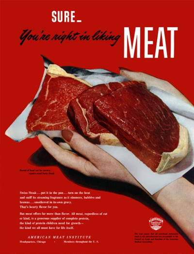
Burnett founded the Leo Burnett Company, Inc., on August 5, 1935. At the time, print ads focused on words, mainly long explanations of why a consumer should buy a product. Burnett believed this type of advertising was misguided he and broke all the rules of advertising. For example, in the mid-1940s, it was basically taboo to depict raw meat in advertising. To ensure their message resonated in a campaign for the American Meat Institute, Burnett’s team not only featured raw, red meat but also placed it against an even redder background. These radical images accomplished their goal catching the consumer's eye. (3)
 |
In the mid-1940s, it was taboo to depict raw meat in advertising. To send the message home in a campaign for the American Meat Institute, Leo Burnett put the raw, red meat against an even redder background.
|
Creative influences connected to Jeremy's work
“Life in all of its aspects is my creative influence. To support this thought, I’d like to share another quote by Burnett, “The work of an advertising agency is warmly and immediately human. It deals with human needs, wants, dreams and hopes. Its 'product' cannot be turned out on an assembly line.” Burnett’s quote applies to all aspects of design not just advertising. Every communication is different and in that sense one’s creative influences need to come from everywhere and change for the need of what is being created. Design is very much human and influences need to come from life itself. It’s hard to focus in on a specific creative influence because it should come from everywhere.”
I can’t tell you how many times I’ve said this; designers are social commentators of their time. We design in response to what’s happening around us. We mirror what we experience, what we see, what we feel, what inspires us. So yes, life truly does inspire and influence. I ask this self identified influences question to every featured “shout out” designer hoping to find connections to these influences as I look through their body of work. Jeremy’s answer rings true but also leaves me in a quandary. Asking this question I anticipate a response citing designers, pieces of works, design movements and styles, but not such a philosophical response. That Jeremy is a thinker and this insight is what makes him such an effective visual communicator.
Jeremy's words of wisdom to impart to other designers
“Love what you do but never get too attached to any of your work. While I’ve worked on projects for a lot of clients, I only have a few pieces that have been produced. A lot of ideas “die” before they even get to the client and a lot more of those ideas “die” when they do get to the client. It’s the nature of the business, especially working for a larger agency. The bigger the agency usually the more levels your work has to pass through before even getting to the client. I’ve learned to love my ideas and stand up for them, but sometimes you just have to let things go. Usually the reason work gets killed isn’t even about the creative. Sometimes it’s budget or too many similar ideas. Some projects stop and I’m not even told why. It can get frustrating but don’t let it get you down, move on, stay positive and eventually you’ll get your break.”
Jeremy’s comment speaks volumes to me. We need to pour our heart and soul into every project, but at the same time retain some sort of distance from it. Not everything concepted and presented makes it to the final, produced finish line. It doesn’t matter if you spend 30 minutes developing a concept or 30 days, if the client doesn’t like the idea it’s on the cutting room floor. If you believe in an idea, fight for it. Sell it and present it with passion and give it a fighting chance.
Design is more psychology than it is type and image. What makes us tick? What motivates us? How do we act or react to a message? The more you understand people the more effective your message will be. This goes for both the consumer and the client. I don’t care how effective a design solution is, if your client doesn’t trust you, you won’t convince them it’s the best solution. Chances are that design won’t get the chance to communicate to the consumer and will end up on the discard pile. You must be just as effective at presenting the idea as you are coming up with the concept. It’s your job to convince the client first! Presenting design concepts to a client is much like convincing them to walk to the edge of an active volcano. The client must trust you enough allowing you to take them beyond their comfort zone. Work to instill confidence ensuring you both can go to that edge but you won’t push them in! If there isn’t trust, you’re not getting them anywhere near that edge.
“Always believe in your ideas and be confident in them, if you’re not confident in an idea, it's probably not even worth presenting. It’s amazing how much a little confidence sells an idea.”
What is your creative process? Do you have a routine you follow when you create?
“I think paper and pencil is pretty much the start for most creative. I’ve yet to meet someone that jumps straight to the computer and starts creating. Sketching is the best start for your ideas. It can be very serendipitous and I amaze myself with the things that come out of sketching.”
Like Jeremy, I sketch out ideas all of the time and sketching is a practice I swear by. The benefit of sketching is getting ideas down quickly without too much time or effort invested. Another benefit of this speedy idea generating technique is developing truly unique, stand out ideas. In design, an original concept (one that is truly stand out and unique) is important for it’s unexpected and will surely stand out from all other messages being shouted at the consumer. Your first idea can be a good one, but the problem is 9 out of 10 designers would probably come up with the very same idea! How innovative and stand out is the idea if most people come up with it?! Probably not all that much.
Have you ever tried concepting using word webs? Word webbing is writing down numerous words or ideas and then building ideas from them. One word or idea leads to another and so on. This all occurs before you even begin to sketch a thing! It’s a helpful and quick way to begin the idea generating process.
“Collaborate and share your ideas. Brainstorming has actually become one of my favorite parts in the process. It’s great working with other creatives and coming up with ideas. Sharing them only makes them better and you’re more than likely going to come across something you didn’t think of on your own.”
The volleying of ideas back and forth takes you down some exciting and unexpected pathways. We each bring a unique perspective to the creative discussion table. Others’ feedback presents ideas you might not have considered previously. Go into this process with an open mind understanding all suggestions are just that, suggestions. Be open to collaboration and remember you’re the captain of your own creative ship. It’s ultimately your decision in the end.
“Put yourself in the shoes of the intended audience. This might be done best while sharing your ideas. How about sharing with someone who isn’t part of the project or isn’t a designer? Some ideas get too caught up in the creativity and end up not being a good solution to the problem.”
We’re not always the intended audience. Use your own voice, insight and perspective in your designs while keeping in mind the person you’re talking to or trying to talk to! What makes them tick? What motivates them? How far can you push them until you turn them off to the idea? Many times your perspective isn’t the right one. Walk a mile in your intended audience’s shoes and perhaps your point of view will change.
Examples that represent the “Gilberto” design aesthetic
“Finding three examples representing my design aesthetic proved harder than I thought it initially would be. Working for an agency and designing for clients usually means sacrificing a little of my own design aesthetic to represent the brand’s aesthetic. It becomes a balancing act of designing my way but still matching the brand’s personality. It’s challenging but this is something that makes me grow as a creative and is really what my job is, otherwise I’m just an artist.”
Norelco. It’s how a man does it.
Jeremy mentions this series is currently in the concept stage. While not produced (yet), he opted to feature this design because it’s a solid representation of his design style and visual voice.
You hear the name Norelco and you might think, “That’s my father’s razor.” There is no doubt, the brand needs to reach and connect with a younger audience. Body hair isn’t your typical topic of conversation and only recently has “manskaping” become openly acceptable. Body hair care is somewhat of an untapped market that no one specific brand owns. The ad series takes a humorous approach (which isn’t hard to do when talking about body hair.) These “manly men” always know the right tool for the job and in this case the tool of choice is the Norelco razor.
Kellogg’s Rise & Shine Program Logo
Kellogg’s believes in the power of breakfast and how it brings out the best in each day. The Rise & Shine program is a partnership with Action for Healthy Kids helping children in homes where breakfast is often difficult to come by. The Kellogg’s logo is somewhat retro/vintage in feel. Jeremy’s process included researching and borrowing elements from different retro designs to capture this vibe in the Rise & Shine program symbol.
Self-Check ads
Self-Chec is a not for profit organization that educates people of the importance of doing self-exams and early detection of cancer. Jeremy’s goal: take a serious subject, present it in a humorous way and educate the male audience about the importance of self-exams. The series of ads is intended to appear in one issue of a magazine, either on sequential pages or interspersed throughout the magazine. In a way, the series functions as a story with a punch line or an element of surprise at the end. The ultimate challenge is making people move on to the next “frame” and to the end of the series.
This design is an example of Jeremy’s early student work. He chose it as a feature piece because numerous elements he uses when designing are found throughout the series. The imagery was created using a combination of pen and ink hand drawn illustrations that were digitized and vectorized in Illustrator with texture layered in. Much of Jeremy’s work utilizes hand drawn illustration for it offers something normally not found in solely computer-generated art.
Jeremy “Gilbertoian” design attributes
After reviewing Jeremy’s body of work, I’m going out on a limb here and taking a crack at extracting some elements that represent his visual voice:
The hand (drawn) is mightier than the mouse
It’s evident Jeremy values paper and pencil in his creative process and even offers a nod to serendipity (happy accidents) that occurs when concepting and sketching by hand. Like Jeremy, I ask you to embrace spontaneity and hunt for “happy accidents” in your own work. Creative exploration can result in the discovery of a single, unique idea you can build an entire campaign upon. Don’t underestimate this creative value!
I have a voice!
One of the benefits of being a visual communicator is the ability to interject your own voice, insight, ideas, perspective, illustrations, photography, writing, hand drawn typography, your own... into your designs. Unique and one-of-a-kind means your work has a platform to stand out from the endless parade of other designs. I’ve always been entertained by Jeremy’s sense of humor and have come to expect smart, humorous and engaging ideas from him. He uses humor to connect with the viewer. As I see it, if you get the consumer emotionally engaged you get the chance to communicate your message.
Texture
Perhaps it’s Jeremy’s process foundation of paper and pencil, but texture makes its way into many of his designs. The resulting effect isn’t overpowering and speaks in a casual, approachable and relaxed tone.
Jeremy Gilberto’s influence on my idea generating/design process
As previously stated, the intent of the “shout out” series is to feature design innovators, gain insight into their creative process, discover how their philosophies influence my own idea generating/design process and offer you a chance for creative inspiration and growth. From a personal standpoint, I want to determine if this hybrid of creativity leads my designs down surprising, unexplored pathways ultimately expanding my own creative toolbox.
The process of learning how someone creates continues to captivate me and delving into Jeremy’s process only adds fuel to the fire. How lucky are we to gain insight into his work, learn about his influences, discover his methods of creating and witness these inspirations woven into his work. Each solution is distinct and yet, there are “Jeremy” attributes and visual elements uniting his entire body of work.
A reoccurring (and quite exciting) challenge throughout this “shout out” series is determining what type of hybrid design to create that unites the featured designer’s and my creative processes. Jeremy is an “ad man.” I know for certain whatever the final design solution is it must fall in line with his area of expertise. This leads me to ask, why not promote the “shout out” series? So there you have it. Jeremy’s inspired design is the development and execution of an ad concept and advertising layout template to promote designers featured in the “shout out” series. Jeremy’s inspired design obviously promotes him, but headline, body copy and imagery utilized in the modular layout change to showcase other “shout out” designers that are featured.
What is an ad concept?
I speak of a concept in the previous paragraph and want to offer clarification. In advertising, think of the concept as the common thread that’s woven into every advertisement found within the advertising campaign. While the visuals and copy often vary in each ad holding the viewer’s interest, the concept (the underlying message you’re trying to communicate) remains constant throughout the entire campaign. The concept connects each of the ads together through a single, common message.
As you’re designing an ad ask yourself “What’s the big idea?” and “Are the headlines, visuals and copy supporting this big idea?” The headline and the main visual unite expressing the underlying message. In most cases when viewing ads we look at pictures first and then go to the headline to clarify what we’re seeing in the imagery. Remember, the headline and visual must support what the other is communicating.
In Jeremy’s inspired “shout out” ad series, the big idea (the single thought carried throughout the entire campaign) is let’s give a giant woo-hoo and proverbial high five to one of our design brethren. The headlines consist of punchy phrases you’d say to a friend you’re giving an animated shout out to. This kudos encourages the viewer to take notice of the design innovator and pushes the viewer to discover more about the celebrated design innovation the ad is alluding to. The celebratory “shout out” is supported by the commanding and exciting call to action “Get inspired!” Remember, working as visual communicators, it’s our job to get people to take notice, comprehend what we’re saying and take action?! For an in depth discussion on this subject, please read my blog post “
What is an ad concept?"
Some aspects of my hybrid design I want to highlight
• dezignrogue is talking here!
While reviewing Jeremy’s inspired ads featured below notice the geometric constructed typography, watercolor texture, modified talk bubbles, the colors (purple and blue) and other visual elements consistently used throughout the campaign. These are visual cues representing the personality and voice of the dezignrogue “shout out” series brand. A consistent use of these brand elements allows the consumer to get to know and become comfortable with the brand and message. That being said, the presentation of these visual elements isn’t screaming 100% “dezignrogue” either. Softer toned “dezignrogue” elements merely suggest the “shout out” is coming from me. I’m introducing Jeremy into the conversation through his image, body copy and headline type choice. All three “Gilbertoian” design attributes balance out the dezignrogue ones creating the desired hybrid.
• I wanna go back and do it all over
Vintage and retro graphic design looks back and borrows elements (typography, color palettes, styles, etc.) from previous design movements. Throughout my creative process I referred to vintage packaging (food/cigarette), imagery (illustration/photographs) and texture to concept and create Jeremy’s inspired design. I found myself particularly drawn to Russian Constructivism.
Well, aren’t you lucky?! You get two graphic design history segments in Jeremy’s “shout out!” A movement with origins in Russia from 1913 to the 1940s, Constructivism renounced art for art’s sake and the traditional bourgeois class of society to which previous art had been catered. It opposed the old order and its conservative art. Instead it favored art as a practice directed towards serving a social purpose. Yes, art was given a social role rarely assigned to it. Constructivism challenged artists to stop producing useless things such as paintings and turn to works that served the new society: industrial design, visual communications and applied arts. (4) Constructivist graphic design ranged from the production of product packaging to logos, posters, book covers and advertisements. (5)
Russia was torn by the destruction of WW1. A Russian revolution against Czar Nicholas occurred where he and his family were overthrown and executed. Constructivism was accelerated by this revolution and pushed to rebuild society in a Utopian model rather than the one that led to war in the first place. (5) The fact that the Constructivist art movement emerged immediately after WW1 is no coincidence. The movement wanted to sweep away all that had gone before and all that had led to the war. The new art for the new order would lead to greater understanding, peace and unity, which would impact the social and economic problems of the day. (6)
One of the main characteristics of Constructivism is a total commitment to and acceptance of modernity. You often find elements of abstraction, reduction (simplifying everything to the most fundamental level), an emphasis on geometric shapes and experimentation when reviewing Constructivist artworks. (6) I’m quite certain you can connect these Constructivist design motifs to many contemporary graphic design works. In fact, developing a geometrical organizational system relating type, geometric elements and photography as a whole is one of my goals for Jeremy’s inspired design.
 |
| A collage of works created during the Russian Constructivism movement (1913 to the 1940s.) Constructivist art is committed to complete abstraction with a devotion to modernity, where themes are often geometric, experimental and rarely emotional. (7) |
 |
The Constructivist era is one of the most referenced art periods in contemporary graphic design. The newly created Constructivist “inspired” designs bring into question, “Is this referencing an homage to Constructivism or a direct rip-off?” (8) I find this line of questioning is common when discussing retro designs borrowing from previous design movements. The top image is the original 1920s design by Russian Constructivist artist Alexander Rodchenko. The others are inspired by the original.
|
 |
American contemporary graphic designer and illustrator Shepard Fairey created a marketing campaign for the upscale department store Saks Fifth Avenue. (9) The campaign, retro and vintage in theme, is based on old Soviet propaganda-inspired imagery and what I believe is a modern interpretation of the Constructivist design motifs discussed above.
|
• Geometric simplicity: triangles, circles and squares, oh my!
When looking at a composition, we often see basic geometric shapes (triangles, circles and squares) first. They’re called “basic” for a reason, are constructivism’s ideal of simplification at work and are found all over my Jeremy inspired design!
Originally the headline and dimensional purple box aligned on the same horizontal baseline as the textured circle pattern resulting in a sterile composition. The circles and squares were equally represented but the triangle felt like the odd one out. Yes, angles reflective of triangles are found in the shaved off dimensional purple box corners but is this enough to truly represent the triangle? A slight rotation of the headline and dimensional purple box presented the perfect amount of angularity, which coincidentally also connects back to common Constructivist design motifs. Yeah me!
So at last, I present you my Dr. Frankendezign creation!
In conclusion
This experimental “shout out” series is far from complete. I’ll continue to champion learning the processes of those we respect and admire. This practice not only furthers our knowledge of graphic design, but also serves to continually present endless inspiration and countless methods of creation. Now, I offer up a challenge. Find who inspires you and ask, “How do you create?” You might be surprised by their response and have a chance to take an amazing journey.
Interested in taking part in the “shout out” series? Then by all means, give a shout out and let me know!
Blog Resources:
(1) http://www.robinlanda.com/Books_Advertising_By_Design__Content.htm
(2) http://www.cnbc.com/id/43896801/Top_Ad_Icons_of_the_20th_Century?slide=11
(3) http://www.top-biography.com/9129-Leo%20Burnett
(4) A History of Graphic Design, Fourth Edition by Philip B. Meggs and Alston W. Purvis.John Wiley & Sons, Inc., Hoboken, New Jersey.
(5) http://www.designishistory.com/1920/constructivism/
(6) http://www.keithgarrow.com/modern-art-styles/what-is-constructivism.html
(7) http://www.arthistoryarchive.com/arthistory/constructivism/
(8) http://judgebyitscover.wordpress.com/tag/constructivism/
(9) http://omgposters.com/2009/01/09/saks-fifth-avenue-marketing-campaign-by-shepard-fairey-and-cleon-peterson/