Monday, July 1, 2013

How about some design inspiration?

Look at what I found wandering the streets of NYC today:

Text Reads: "Remember that week when we were all obsessed with Draw Something? Live in the now, #DrawSomething2" I'm digging this campaign's audience interaction, but there are a heck of a lot of phallic images being drawn! 
This guy could use some Dr. Scholl's. Mixed media: spray paint, newsprint and permanent marker. 
The original posters were torn off leaving the most incredible texture. I'm willing to bet the texture is way cooler than the original poster designs.  
Lightening strikes twice: this shot and the one below are another series torn poster textures! 
A vintage poster style campaign touting the musical The Great Comet. Based on the scandalous slice of War and Peace, The Great Commet is a performance like none other, blending romance, cabaret, comedy and vodka. Here's the site the campaign directs you to: http://kazinonyc.com
Tell me this sign doesn't look like it's a larger version designer's hand drawn sketch?! The grey drop shadow in the Friedmans type (especially the MAN letterforms) is a great unexpected surprise (accident?!). Don't get me started on the hand written type. The leading, the word spacing, hysterical!
This sign is found directly above the one below. The haphazard collage keeps the viewer engaged. There is much to discover in the image layering.  
How about blackletter type mixed with some tagging?
Put your history of design thinking caps on... what movement does this remind you of? 

Wednesday, April 17, 2013

The evolution of digital type


Discuss the evolution of digital type, from early experiments to more recent designs. Include at least three designers and discuss their typefaces. Include names of influential foundries and identify relevant software.

Wednesday, April 10, 2013

Cultural influences in graphic design


Regardless of how rapidly technology shrinks the world community, cultural influences will likely be identifiable in graphic design. Defend this statement, offering examples of national styles. Can you identify graphic elements, principles and ideals that connect design works to their national style?

Wednesday, April 3, 2013

Conceptual images


In the decades following World War II, the creation of conceptual images became a significant design approach in Poland, the United States, Germany and Cuba. Conceptual imagery demonstrates the designer/illustrator interjecting their voice into their work. One doesn't have to use someone else's words, thoughts or ideas to develop and communicate a message. 

Describe the characteristics of conceptual images and the circumstances that influenced the emergence of the conceptual image in graphic design beginning in the 1950s. 

Discuss the needs to which designers responded and cite a specific example of a designer and a design solution from one of the countries mentioned.

Wednesday, March 27, 2013

New-wave typography, the Memphis and San Francisco schools and retro and vernacular design

Discuss the following three directions of postmodern graphic design: new-wave typography, the Memphis and San Francisco schools, and retro and vernacular design. Describe characteristic elements of each and offer examples of work by specific designers.


 New-wave Typography


The Memphis Group
http://www.deconet.com/blog/home/entry/post_modernism_at_utopia_oslo    


San Francisco School


Retro and Vernacular Design

http://www.frenchpaper.com/csa_and_french.asp


Wednesday, March 20, 2013

MTV


In 1981, Music Television (MTV) went on the air. Describe MTV’s unique approach to visual identity, including cultural context and influences, and the design firm and designers who designed its identity.


The MTV logo was created by Manhattan Design, a graphic design collective (Pat Gorman, Frank Olinsky, Patty Rogoff and Fred Seibert). The distinctive “M” was actually a sketch by Rogoff. The “TV” was spray painted by Olinksky.

http://rohitcgartist.blogspot.com/2013/01/mtv-logo-history.html


Wednesday, March 13, 2013

European/American modernist design + the New York School


Although American modernist design originated in European modernist design, it quickly developed a uniquely American approach. What are the differences between European and American modernist design, as represented by the so-called New York School, including the influences of American culture and society? Identify designers of the New York School who introduced unique approaches to modernist design, and cite specific examples of their work (URLs) that aren’t found in Meggs’s A History of Graphic Design to support your discussion.

A few designs reflective of the period to offer you some inspiration:


New York School Innovators

Paul Rand was an American graphic designer, best known for his corporate logo designs, including the logos for IBM, UPS, Enron, Westinghouse, ABC, and NeXT.


Saul Bass was an American graphic designer and filmmaker, perhaps best known for his design of film posters and motion picture title sequences.


George Lois is an American art director, designer and author. Lois is perhaps best known for the covers he designed for Esquire magazine from 1962 to 1972.


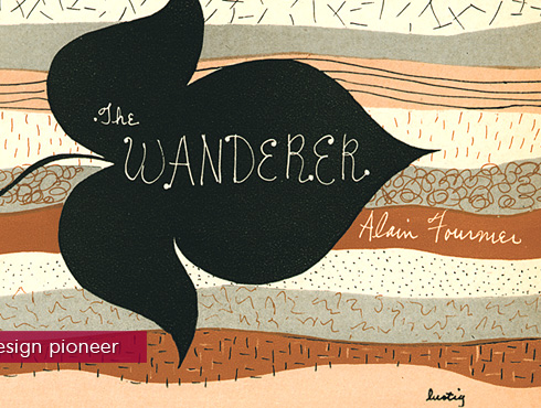
Alvin Lustig was an American book designer, graphic designer and typeface designer. He studied at Los Angeles City College, Art Center, and independently with Frank Lloyd Wright and Jean Charlot. He began designing for books in 1937.


Wednesday, March 6, 2013

Josef Müller-Brockmann and the the golden mean


In his 1960 exhibition poster entitled “Der Film,” Josef Müller-Brockmann designed to a grid based on the mathematical proportions of the golden mean. Explain the golden mean and how it is applied in this work. Include in your post an explanation of how the structure and typographic design effectively communicate meaning. Discuss and provide links to additional Müller-Brockmann examples and also locate contemporary design examples inspired by his work and the golden mean. 

P.S. creativebloq.com does a sweet job explaining and offering visual examples of the Golden Ratio. Check it here >


Additional Müller-Brockmann examples for inspiration: 


Contemporary examples inspired by Müller-Brockmann and the golden mean:
Müller-Brockmann's quote and cited contemporary examples can be found at: nomadcreatives.com/wp-content/uploads/2012/05/Muller-Brockman.pdf


Wednesday, February 20, 2013

Government-sponsored programs, modernism and American graphic design

Corporate leadership and government-sponsored programs helped usher modernism into American graphic design during the first half of the twentieth century. Discuss how government-sponsored programs (specifically, the Rural Electrification Administration, the Federal Art Project of the Works Progress Administration and the U. S. Office of War Information) helped usher modernism into American graphic design. Identify designers and links to examples of their work that aren’t found in Meggs’s A History of Graphic Design in your post.

Keeping up with science (LOC) Weisberg, Shari,, artist. Keeping up with science Illinois : Federal Art Project, WPA, [between 1936 and 1939]

See America. Welcome to Montana. Richard Halls Designer Works Progress Administration, Federal Art Project, NYC Maker United States Travel Bureau, Washington, D.C. Commissioner

No enemy sub will dare lift its eye if you lend your Zeiss or Bausch & Lomb bino culars to the Navy : pack carefully, include your name and address : send to Naval Observatory Washington D.C. [between 1941 and 1943]. Library of Congress Prints and Photographs Division. Reproduction Number: LC-USZC2-5161.

Keep mum - the world has ears / Grigware. Edward T. Grigware. [between 1941 and 1943]. Library of Congress Prints and Photographs Division. Reproduction Number: LC-USZC2-5554.

New Deal WPA poster - Federal Art Project

East side, West side exhibition of photographs. Anthony Velonis. 1938. Library of Congress Prints and Photographs Division. Reproduction Number: LC-USZC4-6179.

Cellar ceilings must be fire-retarded : Keep cellars clean / MW [monogram]. Martin Weitzman. [1936 or 1937]. Library of Congress Prints and Photographs Division. Reproduction Number: LC-USZC2-5397.

Rural Electrification Administration Advertisement Source: NRECA

Design for Container Corporation of America. Egber Jacobson 
Design for Container Corporation of America. Egber Jacobson

Design for Container Corporation of America. Cassandre