Although
American modernist design originated in European modernist design, it quickly
developed a uniquely American approach. What are the differences between
European and American modernist design, as represented by the so-called New
York School, including the influences of American culture and society? Identify
designers of the New York School who introduced unique approaches to modernist
design, and cite specific examples of their work (URLs) that aren’t found in
Meggs’s A History of Graphic Design to support your discussion.
A few designs reflective of the period to offer you some inspiration:


New York School Innovators
Paul Rand was an American graphic designer, best known for his corporate logo designs, including the logos for IBM, UPS, Enron, Westinghouse, ABC, and NeXT.


Saul Bass was an American graphic designer and filmmaker, perhaps best known for his design of film posters and motion picture title sequences.


George Lois is an American art director, designer and author. Lois is perhaps best known for the covers he designed for Esquire magazine from 1962 to 1972.


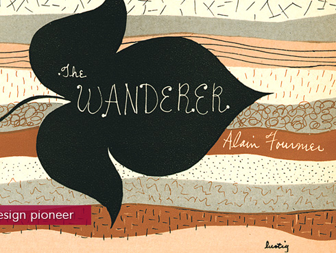
Alvin Lustig was an American book designer, graphic designer and typeface designer. He studied at Los Angeles City College, Art Center, and independently with Frank Lloyd Wright and Jean Charlot. He began designing for books in 1937.

The American approach to modern design borrowed ideas from European design, mostly because Europeans immigrated to America to escape Fascism and totalitarianism. However, American designers eventually created their own concepts. American design was more practical and informal, in contrast to European’s “theoretical and highly structured” work (1). Because New York City is such a melting pot of different cultures, the New York School was able to draw and learn from their environment. American designers strove to incorporate original techniques and concepts into their designs, creating a happy bond between good communication and personal expression.
ReplyDeletePaul Rand was a huge figure that started the American approach to modern design. He loved to reduce messages into powerful symbols and he created many innovative, playful solutions to visual problems. To Paul Rand, modernism “means integrity; it means honesty; it means the absence of sentimentality and the absence of nostalgia; it means simplicity; it means clarity” (2). Each of his designs is smart and ties into the American love for originality, practicality and simplicity. He combined many different techniques, styles and compositions to make sure that his work is unique. His Ancient Age poster uses collage and photography to advertise a brand of whiskey (3), but another poster uses simple shapes and patterns to advertise El Producto (4). There’s both very different, but still successful.
(1) Megg’s History of Graphic Design
(2) http://www.paul-rand.com/
(3) http://www.paul-rand.com/assets/gallery/ads/ancientage06.jpg
(4) http://www.paul-rand.com/assets/gallery/ads/ancientage06.jpg
Katie, as discussed in our conversation, this affinity for originality of idea and point of view still holds true in visual communication today. The key to a successful message is adding your own spin on the concept for what you bring to the creative table is truly unique.
DeleteI really like the part of Rand's quote, "...it means the absence of sentimentality and the absence of nostalgia..." I think that is an extremely important thing to remember when trying to create something new and original. It relates to the work we create too, for example: when putting together our portfolios it can be hard to let go of some pieces because we feel attached to them, even if we know that our style has progressed and it no longer fits.
DeleteI agree with everything that had been said about moving on and shifting from an specifically practice or work. however I believe what makes "Modernism" so innovative and original and that exactly what Paul Rand tried to approach. A new vision that has been somewhat influenced by past aspirations but in one way or another become a whole new different story.
DeleteAmerican modernism very similar to modernism claims the power of human beings to create, innovate, improve in different levels, and reshape what they got as the environment. American modernism continuously plays with scientific knowledge, technology and experimentation. It started as a representation in beginning of the 20th century, but it tremendously benefited from the diversity of immigrant cultures. “African, Caribbean, Asian commonly inspired artists and European folk cultures and embedded these exotic styles in their works”. Most American design has inserted humor built in to it.
ReplyDeleteModernism in Europe can be dated from 1910 to the 1970s. Modernism is linked mostly with neo-classicism and art deco rejects the ideology of realism allows “through the application of reprise, incorporation, rewriting, recapitulation, revision and parody in new forms”.
Alvin lustig, “created monuments of ingenuity and objects of aesthetic pleasure”. In his most famous works he utilizes symbolic acuity ( in the fist example), compositional strength and typographic craft that appears to be a preferred based for book covers or book jackets. His designs use fragmented images, photo-illustration, minimal typography and a symbolic Grid. Lustig chose to be an experimented designer.
1- http://www.designishistory.com/images/lustig/lustig01.jpg
2- http://payload.cargocollective.com/1/2/88505/1989091/herbert-read-the-green-child.jpg
3- http://2.bp.blogspot.com/-doHsOPcKZlk/TeFS1tLE6AI/AAAAAAAAAWw/jXpVnN3ZOgY/s1600/lustig2_edit.jpg
Maria, your statement, "Lustig chose to be an experimented designer" resonated with me. Solid design solutions are often the result of strategy and detailed planning. That being said, great design solutions result when you add experimentation and happy accidents into the mix. We should all follow in Lustig's footsteps and choose to be experimental visual communicators!
DeleteGoing off Prof. Ballas' comment, I think that experimental spirit is what helped propel modernism forward. If artists such as Lustig had been satisfied with the techniques of the past and never tried anything new, moderism would have quickly become a passing trend, instead of the movement it became.
DeleteI like that American design was partly a result of all the different cultures mixing together. We're a country made from other cultures, and it makes sense that our design philosophy encourages diversity too.
DeleteI agree with you and Katie. I think that it is really interesting that American modernism stems from different cultures and diversity while European modernism is based off of realism and past movements as well as the war. It is interesting to see how different people in different areas interpret the same type of design movement.
DeleteAmerican modernist design owes its beginnings to European modernist design, although there are some key differences. European design was “often theoretical and highly structured; American design was pragmatic, intuitive, and more informal in its approach to organizing space” (1). The way American way of life, being more capitalistic and competitive than the European lifestyle/values, influenced design. American design held originality of concept in high regard and artists aimed to inject their personal styles, expressions, and views into their work in an open along with the direct presentation of information (1). The New York School movement had a large impact on design from the 1940s till the 1970s (1).
ReplyDeleteDesigners such as Paul Rand, Saul Bass, and George Lois introduced unique approaches to modernist design. Rand, known as the father of modern design, created many corporate identities, such as the logo for Yale Press (2). He was also the art director for Direction magazine (1), famous for his ability to utilize contrasting elements in design. Bass is best known for his reduction of images into a single dominant image (1) as well as his hand-cut and hand-drawn style of typography and rules, as can be seen in his design for West Side Story (3). George Lois frequently pushed the envelope on how far and how controversial he could take his designs. He was a big name in the advertising world, famous for his covers for Esquire magazine that forced society to think differently, like this September 1969 issue that challenged authority (4).
(1) http://www.csun.edu/~pjd77408/DrD/Art461/LecturesAll/Lectures/Lecture09/NewYorkSchool.html
(2) http://stocklogos.com/sites/default/files/yale.jpg
(3) http://1.bp.blogspot.com/_RR0ClH8h3kg/TGRBwHriFVI/AAAAAAAAH0c/eladNC68UjA/s1600/west_side_story_xlg.jpg
(4) http://www.georgelois.com/pages/Esquire/Esq.kids.html
Im absolutely interested about the last cover magazine image by George Lois. I definitely see the "controversial" part of this image and the unthinkable. It almost encourages me to speak up. It has the humor of the American modernism in it.
DeleteOriginality of concept was prized then and it still is today thankfully!
DeleteAs I've learned about design, problem solving was been a recurring theme in most designers work process, where I feel sometimes it isn't always originality of concept but just the best solution to the visual problem.
DeleteMuch of American modern design is similar to European modern design considering European immigrants fled to America to escape the obstruction from Totalitarianism. The European design was theoretical and highly structured. As for American design was pragmatic, intuitive, and less formal as for organizing space. America emphasized on the expression of ideas, and was open to direct presentation of information. Technique and concepts was key when it came down to designs, while still maintaining personal expressions to break away from competitors. (1)
ReplyDeleteAmerican designers such as Paul Rand, and Saul Bass, were key to introducing and producing the Modern Design to America. Paul Rand was attracted to the modern movement and especially it’s influence with New York City. Rand would analyze a message, reduce it, produce a symbolic meaning, and then communicate the message through dynamic visual forms. (2) He often altered ordinary symbols to reintroduce it’s meaning through images, textures, collages, and montages. Rand brought concepts and symbolic contrast to create effective modern designs. Rand’s success shortly influenced Saul Bass to take the New York School to Los Angeles. It was Rand’s use of shape and asymmetrical balance, with the use of a single dominant image that Bass was most keen and influence by. Like Rand, Bass also reduced messages to powerful, simple pictographs images that enabled his audience to understand and interpret immediately. (3) Saul shortly after included these concepts and techniques to compliment his animated film titles, logos, theater posters, and advertisements. Bass created the first comprehensive design program that unified print and media graphics. With all of Bass accomplishments, he is deservingly acknowledged a master of the film title. (1)
(1) Megg’s History of Graphic Design
(2) http://philipregan.files.wordpress.com/2008/03/prand.png
(3) http://melindakiba.com/wp-content/uploads/2012/02/its_a_mad_mad_mad_mad_world_poster_saul_bass.jpg
Even though American modern design was inspired from European modern design, there were a lot of differences between the two. European design was more structured and theoretical, American design was more intuitive and opinionated. The New York school was influenced by all the culture around them in New York City and focused more on ideas and expression. "The poets, painters, composers, and musicians often drew inspiration from Surrealism and the contemporary avant-garde art movements, in particular action painting, abstract expressionism, Jazz, improvisational theater, avant-garde music, and the interaction of friends in the New York City art world's vanguard circle" (1). They were more diverse with their arts and it spread to other forms of art.
ReplyDeleteAn artist I found interesting from this art era is Saul Bass. He was known for his motion picture title sequences and has worked for people such as Alfred Hitchcock, plus Otto Preminger, Stanley Kubrick and Martin Scorsese. His work has a very graphic feel to it with the paper cut art. One example that I liked was his posters for The Shining (2). I like the use of flat color with the dotted images on top. Another example of his work is his poster for The Fixer (3). I like the pop of color used with the simple yet complicated line drawing. His style of art is very simple but very effective. I find that his art is very enjoyable and easy to understand.
1. http://www.citrinitas.com/history_of_viscom/modernists.html
2. http://www.thefoxisblack.com/2012/12/11/saul-bass-poster-sketches-for-stanley-kubricks-the-shining/
3. http://www.watchthetitles.com/articles/00206-Saul_Bass_posters_and_storyboards_in_London
I really love Saul Bass work. I didn't realize he also did work for The Shining, which I guess I just have all the more respect for this artist. I think his graphic images really stuck in his era and aided to the successes for those who he worked for.
DeleteI agree with Jessica, his designs were very simplistic, bright and they stood us. Just what you needed to communicate with the viewer and make them want to know more.
DeleteIt's cool how American design stems from inspiration from so many different movements, philosophies and techniques, but we changed it and made it something of our own. That's basically what design is today; almost everything has been done and it's hard (if not impossible) to design something that's completely original. We're influenced by past designs, and we draw inspiration from it to make things that are similar but also different in its own way.
ReplyDeleteAlthough true I feel that despite the past influences a designer should always strive to innovate, imitation is the basis of learning so it's only natural that people would try to emulate something that has been proven to work.
DeleteI think it's really interesting how designers innovate new types of techniques and ideas into their work with different movements. I wonder if the absence of people like Saul Bass and Paul Rand, would halt the progression of the movement, or perhaps the movement would of taken a completely different turn..
DeleteIt's interesting to see the evolution of graphic design, especially the recent history, because it really puts things in perspective and allows us to see the mix of tradition and innovation in today's graphic design
DeleteAmerican modern design was heavily inspired by European modern art;However the two had their differences.. American design was more opinionated and informal in its when it came to dealing with organizing space. European design focused more on structure and was known for being more theoretical. Like most organizations and companies do today, the New York school was influenced by the surrounding. The types of people, the neighborhoods etc. all played a part in creating the identity. American designers focused on trying to incorporate traditional techniques into their work in order to create a well thought out balance of personality and expression. One designer who knew how to feed off of and benefit from his surrounding was George Lois. George Lois is one of the most accomplished progenitors of "Big Idea" advertising. He was known for making work that grabbed his audiences attention for reasons good or bad. He made was not afraid to speak his mind through his work which caused a lot of controversy, but as controversial as they were, they successful.
ReplyDelete“Great ideas can't be tested, only mediocre ideas can be tested."- George Lois
Megg’s History of Graphic Design
http://arthistory.about.com/od/modernarthistory/a/abstract_expressionism_10one.htm
Examples:
The magazine covers all how strong compositions that allow type and image to coexist. They all have a very in your face, straight to the point feel. There are hits of irony, and clever uses of cropping and other forms of altercation to images in order to make his point clear almost in an insulting yet funny way.
http://www.georgelois.com/esquire.html
Here are some advertisements created by George Lois
http://www.fluffylinks.com/george-lois
You are right George Lois knows how to grabb people's attention. I went on the link what you provided and I think the shaving girl cover is the most attention grabbing. I had to clink on it and read what it is written about it. I learned this issue is about a women's movement for liberation from women's traditional roles. -Thank you for this post!
DeleteI really liked the George Lois examples. They are a good example of the tradition with a mix of humor. The magazines are very eye catching and make you want to read the articles for the interesting images.
DeleteAlthough Americans at the 1913 Armory initially rejected European modernism the influx of imported European immigrants, who were seeking escape from political totalitarianism, gave Americans a first hand view of European modernism. By the 1940s Americans began to take baby steps into a their own original approach of modern design, during this time New York City served as the catalyst for the birth of American modernism. American modernism developed quite differently than its European counterpart in that while European modernism was highly structured and theoretical, American modernism was informal, pragmatic and intuitive. The reason for the huge difference in approach and style of American modern design and European modern design is mostly do to cultural differences and structure of society. America during the 1940s just emerged as a world super power after World War II; a country, which was new in comparison to other countries with a diverse population, capitalistic values, and a favoring of technique and concept, helped to shape modernism in America.
ReplyDeleteTwo designers of the New York School that had unique approaches to modern design were Paul Rand and Lester Beall. Paul Rand was one of the prominent graphic designers who helped in establishing the Swiss Style of design in the United States. In the 1930s in trained at Pratt Institute, Parsons School of Design, and the Art Students League. Rand can be described as a versatile designer who has worked on every thing from media promotion and book design, advertising design, and corporate identity designs. Rand believed that “The sincere artist needs not only moral support that his belief in his work as an aesthetic statement gives, him but also the support that an understanding of his general role in society can give him”.
Lester Beall was a graphic designer who was known for his effective and innovative design solutions. He studied European avant-garde, taking pieces of it and incorporating it into his own design aesthetic, proving to American businesses that a designer was professional who could solve problems creatively while at the same time handle the issues of pragmatic issues of marketing and budget. Beall’s believe was that a designer “must work with one goal in mind—to integrate the elements in such a manner that they will combine to produce a result that will convey not merely a static commercial message, but an emotional reaction as well”
Out of the two I personally like Beall because I feel his approach to modernism helps give a more structured idea of working with corporate businesses and developing interesting brand identities.
Paul Rand’s design work:
http://library.rit.edu/gda/sites/library.rit.edu.gda/files/imagecache/gallery_full/DSC_2590.jpg
http://library.rit.edu/gda/sites/library.rit.edu.gda/files/imagecache/gallery_full/DSC_2591.jpg
Lester Beall’s design work:
http://www.aiga.org/uploadedImages/AIGA/Content/Inspiration/aiga_medalist/MD_BeallL_FredomPav_640.jpg
http://www.aiga.org/uploadedImages/AIGA/Content/Inspiration/aiga_medalist/MD_BeallL_War_640.jpg
Sources:
Meggs’ History of Graphic Design
http://www.aiga.org/medalist-lesterbeall/
http://www.csun.edu/~pjd77408/DrD/Art461/LecturesAll/Lectures/Lecture09/ModernMovementAmerica2.html
http://library.rit.edu/gda/designer/paul-rand
I really like the second example of Paul Rand's work you provided, it has a sense of irony that a lot of people are trying to capture today. He not only incorporated the IBM logo who he was targeting with this piece but he did it in subtle way. It is a clever piece and keeps the eye moving.
DeleteAfter reading what you have written about Lester Beall and looking at the two examples you gave, I have to say I really like the second one. The "Hitlers Nightmare" has great choice in color and text choices. When looking at this piece I not only see a message, I get an emotional reaction from it, one that really gets me reading through the design and getting a feel for the way the designer incorporates his message. Beall has an extraordinary way of giving a structured idea of working with corporate business, like you said, and an interesting approach to modern design.
DeleteThe first example of Beall's design is really strong on message. You don't even have to live in that period of time to know what is trying to say the poster, that's a great work.
DeleteThe beginning of modern design in America was in fact imported from European immigrants that were seeking to escape political totalitarianism. European immigrants provided Americans with an introduction to the European Avant-Garde. During the 1940s, an original approach to modernist design was taking action step by step. Americans added new forms and concepts to what the Europeans taught them. Designs by the Europeans was often theatrical, and highly structured; American design was pragmatic, intuitive, and less formal in its approach to organizing space. New York City served as a cultural incubator in the middle of the 20th century, nurturing creativity, and its climate attracted individuals of great talent and enabled them to realize their potential.
ReplyDeleteThe U.S is an egalitarian society with capitalistic values, limited artistic traditions before WW2, and a diverse ethnic heritage. Novelty of technique and originality of concept were much prized in this competitive society. Designers sought simultaneously to solve communications problems, present information directly, and satisfy a need for personal expression.
A man of extraordinary talents, George Tscherny, a native of Budapest, Hungary, immigrated to the U.S. as a child and received his visual education there. He headed the graphic design department for the New York design firm George Nelson & Associates before opening his own graphic design office in 1956. Tscherny has functioned as an independent designer, which is unusual in a profession where partnerships, large staffs, and staff positions are the norm. He's an intuitive and sensitive designer, possessing an ability to seize the essence of the subject and express it in stunningly simple terms. His results are elegant, to the point, and disarmingly simple.(1)
Here are some great examples of his work:
http://www.thinkingform.com/2011/07/12/thinking-george-tscherny-07-12-1924/
(1) Megg's History of Graphic Desing Pages 390 and 395-396
I really like his city map and guide designs, especially the one for Paris. The use of creating a wine glass inside the shape of the bottle of wine was clever.
Deletehttp://www.thinkingform.com/wp-content/uploads/2011/07/george_tscherny_18.jpg
The examples you gave are really interesting! A lot of
Deletehis designs actually look very contemporary, especially when it comes to type treatment.
American design and European design tend to be grounded in the influences based on where that particular designer lives. As far as content goes, American design tends to be driven more by whatever trends are dictated by the Marketing Director and Creative Director who are overseeing that particular campaign. I gather that European designers tend to take other approaches primarily based on what their Creative and Marketing Directors deem necessary in their particular countries.Most American design has inherent humor built in to it. But many designers are adept at conversion, so chaos is held to a minimum.
ReplyDeletePaul Rand-In his early twenties he was producing work that began to garner international acclaim, notably his designs on the covers of Direction magazine, which Rand produced for no fee in exchange for full artistic freedom. The reputation Rand so rapidly amassed in his prodigious twenties never dissipated; rather, it only managed to increase through the years as the designer’s influential works and writings firmly established him as the eminence grise of his profession.
(http://www.paul-rand.com/foundation/ads/#.UUTFxlvF0zI)
Saul Bass- Bass was, first and foremost a pioneering 1950s Hollywood designer, the founder of conceptual cover design, who created the motion picture title sequences and posters for a great many films. Saul Bass became the leading title designer in Hollywood; the directors Bass worked in this capacity include Alfred Hitchcock, from 1960 Stanley Kubrick, from 1990 for Martin Scorsese; and, in 1993 Steven Spielberg: the title sequence for "Schindler's List"(http://www.cinemacom.com/saul-bass.html)
Since my major is advertising I am obsessed with ads. For that reason I really liked the Ancient Age Whiskey campaign what you posted. It is very classy.
Deleteps: I used the same source for my post.
I used the same source for my post as well, I even used one of the Ancient Age Whiskey campaign ads for one of my examples. I agree with Sofia, it is very classy and it is also innovated. The whole campaign contains a theme and sticks with it. Even the colors stayed continuous throughout the entire campaign. It wasn't too dull, and it wasn't too flashy. It was very appealing.
DeleteThe late modern period was dominated by American innovations. Inspired by European avant-garde early modern approaches, American artists developed a unique personal style and several superstars were born. (1)
ReplyDeleteAmerican modern artists widely applied the non-decorative approach of the modernists but rejected the dogma. The result was a new simplicity that gained wide popular acceptance. (1)
George Lois is one of the New York school’s innovators. Often billed as the original Mad Man, Lois could also be called advertising’s original Bad Boy. Starting in the '50s, he dished up in-your-face campaigns for the likes of VW, the Four Seasons restaurant, and MTV. Never one to pull a punch, the adman channeled his brash attitude into some of the most provocative images of the 1960s, including now-legendary Esquire covers that took on issues of race, the Vietnam War, religion, and feminism. (2)
Some examples of his work:
(1)http://graphics8.nytimes.com/images/2008/04/24/arts/22858613.JPG
(2)http://www.coverjunkie.com/uploads/1357511459.jpg
(3)http://media.tumblr.com/tumblr_mbj6e5RFHj1qaw2tq.jpg
George Lois is famous for his eye-catching designs. The strong point of a lot of his designs is the photographs that carry a powerful message. Thus, he broke away from the European “neutral photography” style. The 1960s and 70s were an era of social change, and it’s certainly reflected in Lois’s work. The first example shows a woman in a garbage can, said to be “through at 21”. The message is very provocative, Lois points out the western obsession with female youth. Although the type could be used more effectively (i.e. put diagonally in parallel to the woman’s legs), the image is definitely eye-catching.
The second cover depicts Sonny Liston, a heavyweight champion, as black santa. The focus is on his face, and the photo is cropped out to emphasize the face and create tension. It was very controversial at the time, Lois said that several advertisers “took their money and ran”(3), and there were tons of angry letter, but the cover set the spirit of Esquire for years.
The third example shows a creative use of space: the design takes up the front and back of the magazine cover. You can only see the puppet in the front, and when the cover is turned over you can see the puppeteer.
Magazine covers of that time period didn’t include all the information about the issue contents, like they do today. That gave designers more freedom to explore the negative space of the artwork , rather than trying to fit a lot of information on the cover.
(1) http://gds.parkland.edu/gds/!lectures/history/1945/latemodern.html
(2) http://www.fastcodesign.com/1670603/10-tips-for-success-from-george-lois-the-original-mad-man#1
(3) http://www.georgelois.com/pages/Esquire/Esq.sonny.santa.html
After looking at your examples of George Lois's work as well as some others in Meggs History of Graphic Design, I really like your choice to talk about him as an artist. I love the minimalism and use of white space in much of his work. I thought it was especially effective in his Esquire Magazine covers and his advertisement for Coldene. I think negative space and the whole "less is more" idea is sometimes really undervalued but George Lois shows how effective it can really be.
DeleteIn the early XX. Century Europe was the leader of the modern art. European artists introduced avant-garde to America and while during 4 decades modern art was not popular in the US around 1940 original American approach was emerging to modernist design. Americans added new forms and concepts to modern art. European art was often theoretical and highly structured, American design was more pragmatic, intuitive and less formal in its approach to organize space.
ReplyDeletePaul Rand one of the artists who initiated the American approach to modern design. He was the editorial designer for the Apparel Arts, Esquire, Ken, Coronet and Glass Packer magazines. His ability to reduce forms to the symbolic essence without making it sterile or dull made Rand became very influential in a very early age. He created visually dynamic, playful and often unexpected ways o communicate. Rand defined design as the integration of form and function for effective communication.
I found a quote from Paul Rand which I really liked: "Design is so simple, that's why it's so complicated."
APPAREL ART (1940 - April/May)
http://www.paul-rand.com/assets/gallery/editorial/apparelArts_aprMay_1940.jpg
DIRECTION magazine (1943)
http://www.paul-rand.com/foundation/editorial/#prettyPhoto[direction]/114/
PM Magazine (This is my favorite)
http://www.paul-rand.com/foundation/editorial/#prettyPhoto[pm]/0/
Saul Bass was inspired by Paul Rand's use of shapes and asymmetrical balance. However Bass' style was reduced to one single dominant image, while Rand tended to use complex contrast of shape color and texture. Bass irregular forms are cut from paper with scissors or drawn with brush. Freely drawn, decorative letterforms are often combined with typography or handwriting.
Saul Bass' work:
http://2.bp.blogspot.com/-MG2syriZtFU/T0WdGkt4VHI/AAAAAAAAAKI/jhBchxDs1Jo/s1600/its_a_mad_mad_mad_mad_world_poster_saul_bass.jpg
http://nicholaslcarver.blogspot.com/2012/02/15-saul-bass-graphic-designer-logoist.html
Sources:
http://www.paul-rand.com & Meggs' History of Graphic Design page 390-411
I really liked the quote you mentioned of Paul Rand, it does describe design by his point of view and I'm pretty sure that of many designers too. Saul's work examples in the linked gave to me such strong emotions about each one of them.
DeleteModern design in America was basically brought in by extremely talented European immigrants. It was in the 1940’s that they saw steps toward an original American approach to modernist design. Americans borrowed things from the work of Europeans but now they were incorporating new forms and concepts making it more unique. The difference between European designs was that they were often theoretical and highly structured; and American design was pragmatic, intuitive, and less formal in its approach to organizing space.
ReplyDeleteIn 1940’s Alex Steinweiss was named a director of Columbia Records. Steinweiss applied the modern design sensibilities of the 1940’s as he searched for visual forms and shapes to express music. He approached space informally; elements were placed on the casual balance sometimes bordering on a random scattering of forms. One of the works that got my attentions was “Woody Woody” by Woody Herman and his orchestra with Charlie Byrd, guitar. (http://www.alexsteinweiss.com/as_index.html). This cover uses the image as the first letters of the title. It is amazing how the colors of the background are bright but the design still comes out as the first thing of the cover. The thing that doesn’t really work for me it’s the use of the white type in the title that makes the letters disappear at some point.
(1) Meggs' History
(2)http://www.alexsteinweiss.com/as_index.html
I really like the example you posted. I actually liked all of the album covers. They were all eye-catching and fresh and innovative. I think I agree with you when you said that there was one design that had white type in the title that made the letters disappear, I didn't see that until I really looked at it closely. However I found that if I looked at all of the designs as a whole, they had some sort of movement and feel to it, so I didn't catch the white letters disappearing at some points.
DeleteAll the albums by Steinweiss are very interesting. They are each unique and have different meanings behind them. Steinweiss has an interesting way in incorporating visual forms and shapes to make music albums. They all seem to flow and go with the titles. I especially like the Boogie Woogie album cover. I like the use in the hands as if they are playing the little piano, as well as the use of color and text. The way the text is positioned really makes the piece all the more interesting, you get a sense of movement and space which creates an incredible feel for the audience.
DeleteI think that your right when you say that Americans were largely influenced by the European Modernists that came over here during the war. But Modernism wasn't completely European. Americans were catching up in the design field and they were becoming more original in their ideas. I think you are right in saying that European design is a lot more structured though.
DeleteThe Steinweiss examples are extremely eye catching. The colors are eye catching without being too bright. His work is a mix of previous art movements with some reminding me of the constructivist movement with the red and yellow colors.
DeleteThe first trend of modern design in America was imported by the talented European immigrants seeking to escape their countries political structures. They introduced to America the European Avant-garde. European design was often theoretical and highly structured; American design was pragmatic, intuitive, and less formal in its approach to organizing space. The aspects of American culture and society informed the American approach to modern design. The United States is an egalitarian society with capitalistic values, limited artistic traditions before WWII, and a diverse ethnic heritage. Novelty of if technique and originality of concept were much prized, and designers sought simultaneously to solve communications problems, present information correctly, and satisfy a need for personal expression. Since New York City served as a cultural incubator in the middle of the 20th century, it helped nurture the creativity and helped enable individuals of great talent to realize their potential. (1)
ReplyDeleteI would like to say that Paul Rand initiated the American approach to modern design, more than any other American designer. He began the first phase of his design career as a promotional and editorial designer for the magazines Apparel Arts, Esquire, Ken, Coronet, and Glass Packer. A thorough knowledge of the modern movement, particularly the works of Paul Klee, Wassily Kandinsky, and the cubists, led him to the understanding that freely invented shapes could have a self-contained life, both symbolic and expressive, as a visual communications tool. His collaborations with copywriter Bill Bernbach became a prototype for the now ubiquitous art/copy team working closely together to create a synergistic visual/ verbal integration. (1)
Works of Paul Rand:
http://www.paul-rand.com/assets/gallery/ads/ancientage01.jpg (Whisky Ad)
http://www.paul-rand.com/foundation/editorial/#prettyPhoto (Summer 1939)
http://www.paul-rand.com/foundation/paintings/#.UUXawhysiSo (Untitled Watercolor 1952)
(1)Meggs History of Graphic Design
I really like how you mentioned the influence Kandinsky, Paul Klee and many of the cubists on Paul Rand. Kandinsky especially was one that stuck out to me because when I think of Kandinsky I think of his Composition VII piece which is abstract and comprised of hugely loud, vivid colors. Paul Rand, on the other hand, seems so clean and classic and not at all of the same category. However, different things can be taken as influence from every artist so it does make me curious to know how Rand was able to mimic or be inspired by an artist so different from him.
DeleteThis was a great explanation on how they are different and what the american modernist movement entailed. i like how you wrote that it satisfies a need for personal expression, which is completely true.
DeleteThe American Modern Design Movement was brought to us by talented European immigrants whom brought new innovative and creative solutions to the country. Although the American design movement was a build off from European design, they still differ from each other. European design was often theoretical and structured, meanwhile American design was more intuitive and informal in terms of design lay outs (2). In these movements, artists were competitive and designers sought to invent creative ways to solve communication problems and put forth their own personal beliefs in their designs.
ReplyDeleteIn response to Modern European design, the New York School was born. It became a dominant force in design from the 40's until the 70's. Perhaps more than any designer, Paul Rand sparked the beginnings to American modernist design. Rand drew inspiration from past artists such as Kandinsky, Klee, and the Cubists. Utilizing their concepts, Paul Rand developed an understanding that "freely invented shapes could have a self-contained life, both symbolic and expressive, as a visual-communications tool" (2). Paul Rand became the art director for Direction Magazine for 8 years. His work featured dynamic and unexpected graphics that pulled the viewer in. He used collage and montage as a way to bring concepts, images, textures, and images into a cohesive unity. His 1940 cover for Direction Magazine properly showcases his innovative style (1).
(1)http://farm4.staticflickr.com/3293/2301651374_1e2e0e9c34_o.png
(2)http://www.csun.edu/~pjd77408/DrD/Art461/LecturesAll/Lectures/Lecture09/NewYorkSchool.html
According to “Megg’s A History of Graphic Design,” the different between American and European design was as follows: “American design was pragmatic, intuitive, and less formal in its approach to organizing space,” whereas “European design was often theoretical and highly structured.” The “competitive,” “egalitarian,” and “capitalistic” society, merged with diverse cultures had a great influence modern design. The need for direct information and simplistic communication in design, made originality prized.
ReplyDeleteDesigner Paul Rand was widely known for his ability to “manipulate visual form” and communication of content. A few of his designs are the 1966 Poster for Aspen Design Conference
http://www.flickr.com/photos/ajourneyroundmyskull/3057509039/ and The Second Man http://love-you-big.blogspot.com/2009/09/paul-rand-design.html.
As a Hitchcock movie lover, I really like the designer Saul Bass. Another example of his designs is the poster for the movie “It’s a Mad, Mad, Mad, Mad World” http://melindakiba.com/wp-content/uploads/2012/02/its_a_mad_mad_mad_mad_world_poster_saul_bass.jpg. His movie design poster have often been used as inspiration for today, as seen in this design for the popular movie “Precious” http://classes.design.ucla.edu/Spring10/155/wp-content/uploads/2010/05/16.jpg.
Source:
Megg’s A History of Design
The poster for the movie "It's a Mad, Mad, Mad, Mad World" is a great example of Saul Bass' work. He has a great ability to express the heart of a design with images that become simple glyphs or elemental pictorial signs that exert great graphic power—and that is exactly what he does here, with the simplified globe. It has a hand coming out with a suitcase full of money. All black on a red background, and the title in white. Very simple, yet effective. I'm not sure it's supposed to be this way, but when I first looked at it I thought it looked like a hot air balloon.
DeleteI agree with Sam, the poster for the movie was a great choice for the example, it shows that modernism in america was used in everyday life. And you stated some great points on why they are different from each other.
DeleteThere were numerous differences between European modernist design and American modernist design in the mid twentieth century. European modernist design was know to often be theoretical and highly structured. American, on the other hand, was more intuitive and pragmatic as well as less formal in its approach to organizing space. The reason for these two movements differentiating was largely due to the artists that immigrated to the US and brought with them countless different styles and influence from their respective home countries.
ReplyDeleteThe New York School was comprised of many different kinds of these artists. Of all that were a part of the school, Paul Rand was the one most known for the initiation of modernist design. He was skilled at utilizing simple sign and symbols in interesting ways to create an effective visual design. The juxtaposition and alteration of these symbols were what characterized his work. He also found ways to be playful, unexpected and dynamic throughout his work.
Below are some examples of his work:
http://www.asbestian.de/blog/index.php?/archives/2012/03.html
http://www.paul-rand.com/assets/gallery/identity/logo_abc_large.jpg
http://hellohung.com/rand/paul-rand-poster.jpg
Sources:
Megg's a History of Graphic Design
I like the IBM advertisement, it's really clever. It's clear and understandable, even though the letters aren't actually there. The simple "M" creates a nice contrast to the rest of the images.
DeleteI really love the design in the third link you posted. I believe that what you said about Paul Rand is quite evident here—that is work is playful, unexpected and dynamic. The way he splits up the letters in his name is unconventional, yet it works here. The way he varies the colors, and leaves some in black and grey is playful, and not too overwhelming. He activates the white space as well—the way his name is in the top right corner, and the supporting body paragraph is in the bottom left, with the one line dividing the middle—I think it balances out well. The viewer's eye is drawn to his colorful name first although we read left to right, so he was successful in that.
DeleteThe 1940s saw steps toward an original American approach to modernist design. While borrowing freely from the work of European designers, Americans added new forms and concepts. European was often theoretical and highly structured, while American design was pragmatic, intuitive, and less formal in its approach to organizing space. New York City served as the cultural incubator, like Paris did for Europe. Paul Rand initiated the American approach to modern design. His knowledge of works by Klee, Kandinsky, and the cubists led him to the understanding that freely invented shapes could have a self-contained life, both symbolic and expressive, as a visual communications tool. http://www.iconofgraphics.com/Paul-Rand/ This website has some great information about Rand's life, and contains several examples of his works, from his magazine covers to his logos.
ReplyDeleteAnother advocate of the New York School was Alvin Lustig. He incorporated his subjective vision and private symbols into graphic design, and interior design. Lustig's design methodology was to search for symbols to capture the essence of the contents and treat form and content as one. Here are a couple of links to Lustig's designs:
http://images.collection.cooperhewitt.org/39714_71677dcaa8bf7d9f_b.jpg
http://4.bp.blogspot.com/_g7Pi5QP35rw/TOO04Cb2fNI/AAAAAAAAAFo/qcLHch_J99I/s320/1_Lustig_the_wisdom.jpg
Megg's History of Graphic Design
I really like the first example you provided. The abstract shapes and the overlay of colors really come together adding a sense of imagery to the piece. The colored background also adds to the piece, if it were pure white I do not think the image and the body text would have been able to coexist. The tinted paper allowed for the bright colors to be toned down just enough to allow the eye to stay on the body text long enough to take in the information, then move to the abstract image and get lost in the piece.
DeleteModernism is a movement in which artists create, improve and reshape their environment. It is safe to say american modernism and european modernism are similar, mainly because american modernism derived from european modernism.American modernism benefited from the diversity of immigrant cultures. Many Europeans migrated to america for a better life. So americans borrowed many ideas from european artists; but eventually americans started adding their own flare to their work. One major difference between the two is, European designs were theoretical and highly structured, while american design was more pragmatic and informal. American Modernism included visual art, literature, music, film, design, architecture as well as life style. This movement was meant to be incorporated into everyday life. One major designer of the modernist era was Paul Rand. He attended Pratt institute and Parsons The new School of Design. Some of his most famous works are:
ReplyDeletehttp://www.paul-rand.com/foundation/ibm/#prettyPhoto[ar]/19/
http://www.paul-rand.com/foundation/ibm/#prettyPhoto[poster]/4/
sources
http://en.wikipedia.org/wiki/American_modernism
Megg's History of Graphic design
I really like the second link of Paul Rand's IBM. I think the illustration work is very bold and straight forward, which I feels is need for the type of company it is like putting fun in a corporation.
DeleteI shall talk about Paul Rand for this assignment. Rand Paul was, and is still today, the most prominent and influential graphic designer in the United States. He was born in Brooklyn, New York in 1914. His career in the art started as a lowly stock image artist for a syndicate. His year designing stock images proved to be helpful, for his designs became well known. He is perhaps well known for creating corporate identities. His clients included IBM, ABC, UPS and Enron.
ReplyDeleteMost famous of his clients is perhaps his relationship with IBM. His simple designs, not complicated to look at, but immediately identifiable with the public, made him famous in the field of graphic design. Rand points out in A Designer’s Art that “ideas do not need to be esoteric to be original or exciting.” This is true if anyone wants to be a graphic designer. He understood that a design needs to be understood by the public at large, and it can be exciting at the same time.
Rand’s simple yet effective design could be seen in his design for Winter Quarter 1990 UCLA Extension:
http://designarchives.aiga.org/#/entries/%2Bcredits%3A%22Paul%20Rand%22/_/detail/relevance/desc/13/7/4056/winter-quarter-1990-ucla-extension/1
His wide variety of logos for different companies shows Rand’s creativity in “less is more” philosophy.
http://perspectives.charlesluck.com/wp-content/uploads/2011/08/randlogo.jpg